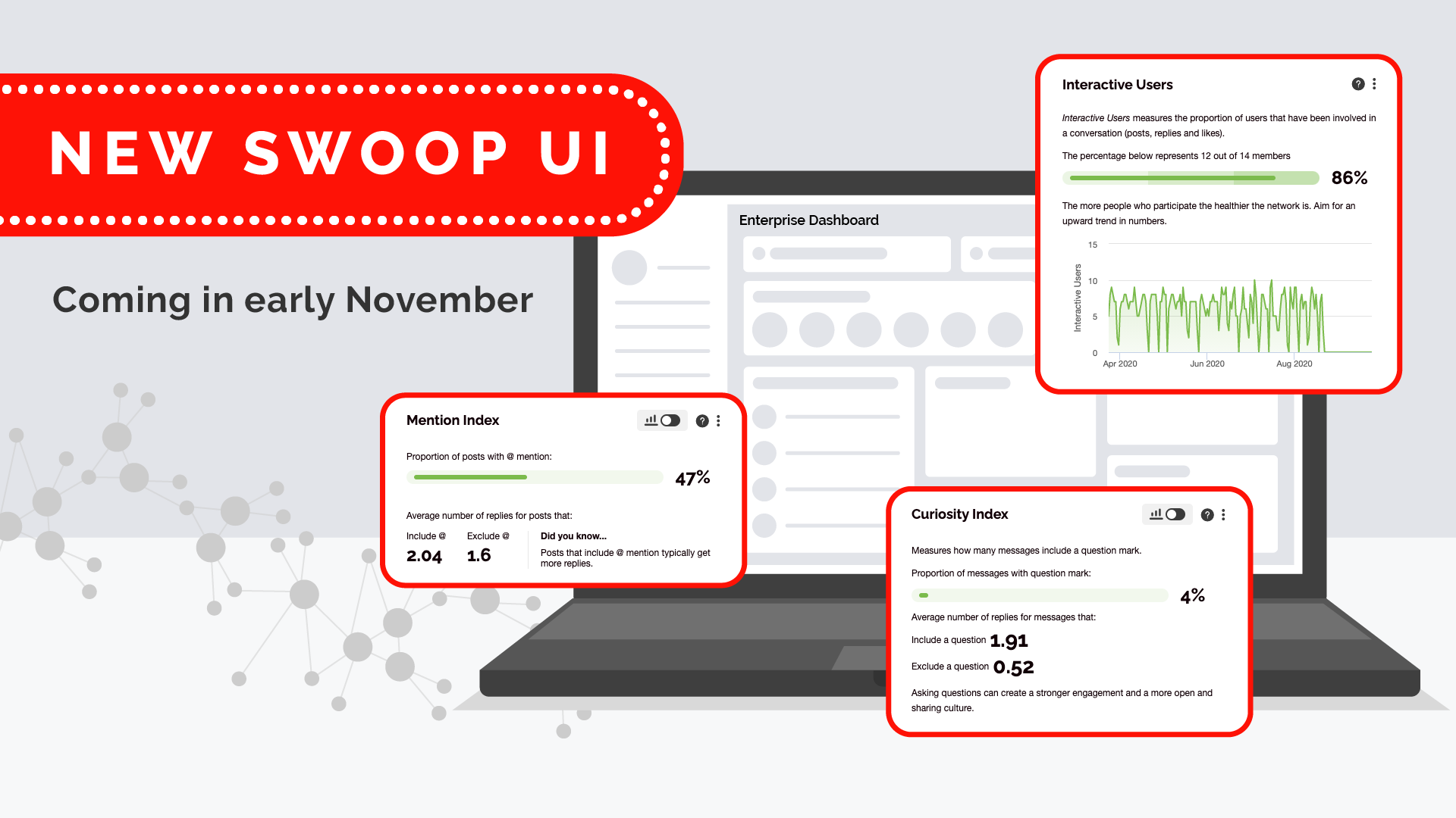
New look and feel for SWOOP
We're excited to deliver to you a complete refresh of the SWOOP user interface (UI), making it cleaner and easier to navigate. The new-look SWOOP dashboard is more modern and packed with the insights you know and love. We’ll start rolling out the refreshed SWOOP on November 5, 2020.
There were a few key reasons driving the new look and feel of SWOOP:
We listened to you! Earlier this year you may remember filling in a customer success survey about all things SWOOP. Navigation and UI was a key theme that emerged in the commentary.
Many customers now use multiple SWOOP products and we want to give you the ability to access them all from the one page. SWOOP’s current horizontal tabs had some restrictions in the optimal use of the screen real estate. The new UI introduces a new main navigation that delivers a better user experience.
The colour scheme of the various reports in SWOOP was originally intended to group insights but had proven too hard to do consistently, leading to a cluttering of colours. The new UI has a simplified colour scheme.
It was time. Web design is a constantly evolving thing, and it was time to give SWOOP a fresh coat of paint.
Highlights of Changes
What has changed? Here’s a list the key changes we’ve made:
Tabs have moved to a new left-hand side menu. From now on we will refer to these as ‘dashboards’.
Search box at the top of the different dashboards makes it easier to search.
Fly-out menu on the right. Select reports and create comparison lists from here.
Date selector has moved to the top of the screen and is now always visible.
‘Take Tour’, ‘Request Support’, ‘Share’ and ‘Logout’ features have moved into a single area sitting behind your profile avatar in the top right.
The ‘About’, ‘Privacy’ and ‘ Help’ links have moved to the bottom right. If you have added custom links there will also be shown here.
We’re going to introduce better export of data for each report, so we’ll be temporarily removing the current ‘picture export’. Before the end of the calendar year the new export feature, which will export the reports data points and/or content to Excel, will be re-introduced.
There are also a couple of changes to the UI relevant to SWOOP Admins:
The access to the admin settings and link to SWOOP Support have been moved to the bottom left.
To ensure the design aesthetics are maintained we've - at least in the interim - removed the ability to apply custom colours to SWOOP.
See a short video here taking you through these changes.
How will the roll-out happen
We’ll start moving everyone to the new UI starting November 5, 2020. It might take a few days for you to see the refreshed SWOOP.
Starting October 16, 2020 we will start showing a banner in the current UI alerting people to the upcoming change. The new UI will also have a banner for the first couple of months alerting people to the change.
Please join our user communities if you have questions, or get in contact with your SWOOP customer success manager.


